
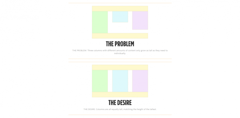
Columns of equal height are required to design the web interface. If all the columns share the same background. If the height of the inner elements are not equal, there will be discrepancies in the interface design of the block as well as the overall appearance of the page.
A few years ago, we used to achieve that effect with some CSS trickery; table display properties for the grid elements was one popular way to get the effect done. Today, we have simple solutions for creating height columns using CSS3.
1. CSS Table properties.
We can make use of Table properties in CSS to achieve equal-height columns . But this is not the ideal solution right now to create layouts, as there are now a number of new alternatives
HTML:
<div class=”col-wrap”>
<div class=”col”>
<h2>Column 1</h2>
<p>Hello World</p>
</div>
<div class=”col”>
<h2>Column 2</h2>
<p>Hello World!</p>
<p>Hello World!</p>
<p>Hello World!</p>
<p>Hello World!</p>
</div>
<div class=”col”>
<h2>Column 3</h2>
<p>Some other text..</p>
<p>Some other text..</p>
</div>
</div>
CSS:
.col-wrap {
display: table;
width: 100%;
}
.col {
display: table-cell;
}
.col:nth-child(even){
background-color:orange;
}
.col:nth-child(odd){
background-color:yellow;
}
2. Using flexbox
Flexbox is way too simplified and easier approach to achieve equal-heighted columns in CSS. You don’t even need to provide a separate row element for the columns, all we need here is to tweak the Flexbox parent and the childs a bit to make them look aligned like a columnar grid.
HTML:
<div class=”f-grid”>
<div class=”f-grid-col”>Lorem ipsum dolor sit amet, consectetur adipisicing elit. Quae, nulla! Assumenda dignissimos harum, molestias iure repudiandae ratione praesentium. Illo facilis et velit ut quam omnis, porro molestiae magni, laboriosam ipsa.
</div>
<div class=”f-grid-col”>Lorem ipsum dolor sit amet, consectetur adipisicing elit. Non, quaerat blanditiis. Eligendi quae tenetur ratione repellendus ut.</div>
<div class=”f-grid-col”>Lorem ipsum dolor sit amet, consectetur adipisicing elit. Quae, nulla! Assumenda dignissimos harum, molestias iure repudiandae ratione praesentium. Illo facilis et velit ut quam omnis, porro molestiae magni, laboriosam ipsa.
</div>
</div>
CSS:
.f-grid {
display: flex;
justify-content: space-between;
margin-left: -1rem;
flex-flow: row wrap;
}
.f-grid-col {
flex: 1 0;
background-color: green;
margin-left: 1rem;
margin-bottom: 1rem;
}
3. Using css grid
The next method we would like to introduce is the method using css grid, This method is slightly more complicated than the aaa sex, you need to calculate the width of the columns inside the parent element.
HTML:
<div class=”g-grid”>
<div class=”g-grid-col”>
Lorem ipsum dolor sit amet, consectetur adipisicing elit. Quia molestiae iure, a laboriosam facere consequuntur repellendus aspernatur porro ut. Doloremque fugiat saepe maiores.
</div>
<div class=”g-grid-col”>
Lorem ipsum dolor sit amet, consectetur adipisicing elit. Architecto incidunt, accusantium, cumque obcaecati similique et ducimus inventore fugiat velit exercitationem dolorem iusto porro repellat accusamus quia eum, quos eveniet expedita!
</div>
<div class=”g-grid-col”>
Lorem ipsum dolor sit amet, consectetur adipisicing elit. Architecto incidunt, quos eveniet expedita!
</div>
</div>
CSS:
– Using the below formulae:
W(adjusted) = W(original) – (G * (n-1)/n)
.g-grid {
display: grid;
/* W(adjusted) = W(individual) – (1rem * 1/2) */
grid-template-columns: calc(33% – 1rem * 1/2) calc(33.3333% – 1rem * 1/2) calc(33.3333% – 1rem * 1/2);
grid-column-gap: 1rem;
}
.g-grid-col {
padding: 1rem;
background-color:red;
color:#fff;
}
4. You can use some other tricky tricks by using float and float explicitly or using a background gradient
• Equal columns with tag div using float and clear float
HTML:
<div class=’container-wrap’>
<div id=”container4″>
<div id=”container3″>
<div id=”container2″>
<div id=”container1″>
<div id=”col1″>
Lorem ipsum dolor sit amet, consectetur adipisicing elit. Voluptates totam distinctio, voluptatem laboriosam amet. Amet, voluptatum nihil ut officiis explicabo dolore quaerat assumenda officia incidunt aut aliquam, tempora ullam quos.
</div>
<div id=”col2″>
Lorem ipsum dolor sit amet, consectetur adipisicing elit. Deserunt provident quo illo magnam tempore facere fugiat nemo aliquid mollitia omnis amet, doloremque, iusto autem! Tenetur voluptas adipisci suscipit, natus saepe. Sint quia laudantium, iste cumque dolor voluptates laboriosam repellat labore, sequi earum sunt recusandae ipsum, rerum est inventore autem aliquid quasi necessitatibus fugiat.
<!– Column two end –>
</div>
<div id=”col3″>
Lorem ipsum dolor sit amet, consectetur adipisicing elit. Consequatur quibusdam sit ratione quam optio culpa omnis ut reprehenderit ab assumenda deserunt sed enim labore, nisi voluptates inventore odit nostrum maxime. Vero sit nesciunt repellat, facere. Possimus veniam impedit error quia officia labore expedita laudantium tempore, ipsum repudiandae, itaque, eligendi quasi.
</div>
<div id=”col4″>
<!– Column four start –>
<h2>Cross-Browser Compatible</h2>
<p>This 4 column layout has been tested on the following browsers:</p>
<h3>iPhone & iPod Touch</h3>
<ul>
<li>Safari</li>
</ul>
<h3>Mac</h3>
<ul>
<li>Safari</li>
<li>Firefox</li>
<li>Opera 9</li>
<li>Netscape 7 & 9</li>
</ul>
<h3>Windows</h3>
<ul>
<li>Firefox 1.5, 2 & 3</li>
<li>Safari</li>
<li>Opera 8 & 9</li>
<li>Explorer 5.5, 6 & 7</li>
<li>Google Chrome</li>
<li>Netscape 8</li>
</ul>
<!– Column four end –>
</div>
</div>
</div>
</div>
</div>
</div>
CSS:
.container-wrap:after {
display: table;
content: “”;
clear: both;
}
#container4 {
clear: left;
float: left;
width: 100%;
overflow: hidden;
background: #b2f0f9;
}
#container3 {
clear: left;
float: left;
width: 100%;
position: relative;
right: 25%;
background: #89ffa2;
}
#container2 {
clear: left;
float: left;
width: 100%;
position: relative;
right: 25%;
background: #ffa7a7;
}
#container1 {
float: left;
width: 100%;
position: relative;
right: 25%;
background: #fff689;
}
#col1 {
float: left;
width: 21%;
position: relative;
left: 77%;
overflow: hidden;
}
#col2 {
float: left;
width: 21%;
position: relative;
left: 81%;
overflow: hidden;
}
#col3 {
float: left;
width: 21%;
position: relative;
left: 85%;
overflow: hidden;
}
#col4 {
float: left;
width: 21%;
position: relative;
left: 89%;
overflow: hidden;
}
• Equal columns using background
HTML:
<div class=”five-columns group”>
<div class=”col”>
<p>Pellentesque habitant morbi tristique senectus et netus et malesuada fames ac turpis egestas.</p>
</div>
<div class=”col”>
<p>Pellentesque habitant morbi tristique senectus et netus et malesuada fames ac turpis egestas. Vestibulum tortor quam, feugiat vitae, ultricies eget, tempor sit amet, ante. Donec eu libero sit amet quam egestas semper. Aenean ultricies mi vitae est. Mauris placerat eleifend leo.</p>
</div>
<div class=”col”>
<p>Pellentesque habitant morbi tristique senectus et netus et malesuada fames ac turpis egestas.</p>
</div>
</div>
CSS:
.five-columns {
width:100%;
background-image: -webkit-gradient(linear,
left top,
right top,
color-stop(0, #eee),
color-stop(20%, #eee),
color-stop(20%, #ccc),
color-stop(40%, #ccc),
color-stop(40%, #eee),
color-stop(60%, #eee),
color-stop(60%, #ccc),
color-stop(80%, #ccc),
color-stop(80%, #eee),
color-stop(100%, #eee)
);
background-image: -webkit-linear-gradient(
left,
#eee,
#eee 20%,
#ccc 20%,
#ccc 40%,
#eee 40%,
#eee 60%,
#ccc 60%,
#ccc 80%,
#eee 80%,
#eee 100%
);
background-image: -moz-linear-gradient(
left,
#eee,
#eee 20%,
#ccc 20%,
#ccc 40%,
#eee 40%,
#eee 60%,
#ccc 60%,
#ccc 80%,
#eee 80%,
#eee 100%
);
background-image: -ms-linear-gradient(
left,
#eee,
#eee 20%,
#ccc 20%,
#ccc 40%,
#eee 40%,
#eee 60%,
#ccc 60%,
#ccc 80%,
#eee 80%,
#eee 100%
);
background-image: -o-linear-gradient(
left,
#eee,
#eee 20%,
#ccc 20%,
#ccc 40%,
#eee 40%,
#eee 60%,
#ccc 60%,
#ccc 80%,
#eee 80%,
#eee 100%
);
}
.five-columns .col{
width:20%;
}
Link demo: https://jsfiddle.net/TrinhThang/0t7xe6hf/7/
That is the method of column height used today, you can choose the above methods to create beautiful web interface, but the current simple, optimized and most commonly used method is the use of css flexbox.