We are going in 2018 with tons of technology developments. Everybody now is using digital resources to look for information, open their own business, create contents, give-and-share things and so many other things. Website development is one of the most important resources to help people to get closer to the information that they want to get. Along with that idea, quality of websites is enhanced so much better to make it easier and more friendly for people to use in various of digital devices such as: Mobile, Tablet, Laptop, … (Responsive design).
If you are planning to get more people’s attention to your website for any purposes, you may want to consider the following things to enhance your web’s quality. Here is some top trending in website design will probably take the crown in 2018.
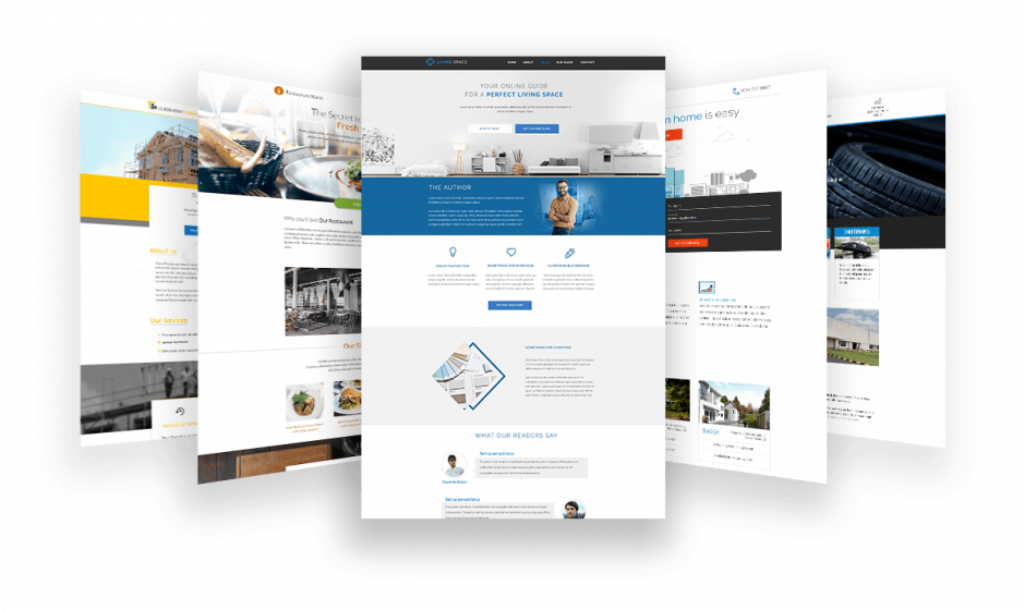
1. Landing Page:
Landing Page is not new to everybody. Let’s recap the concept. Landing page is a single web page which has oriented and vivid content of a specific product to get potential customers’ actions. All the advantages and features of your products will be presented in this single page.
Landing Pages have highest rate of customer’s attention and SO ranking. If you are in a marketing campaign, landing page can be considered as a must-have tool to attract and convince customers to take action.
So Landing Pages are still developing and take the trend in 2018.

The more attractive your landing page is, the more efficiency you get.
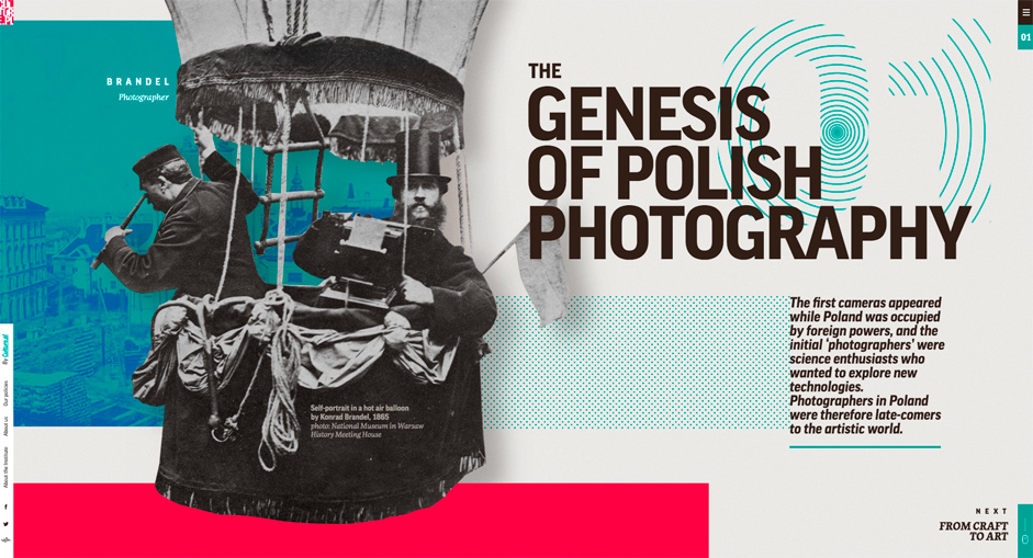
2. Story Design:
Click-to-browse is so old-fashioned. Sometimes it takes forever to click and load the whole page. Too many actions! People just want to scroll.
According to some researches, Internet users prefer scrolling to clicking. Moreover, there are more than 90% users using smartphones to browse. For that, scroll-to-browse will be trending to satisfy those 90% users.
This trend can be much more efficient with websites that want to attract users by telling them a clear story. It brings focus, creativity and joy. By replacing clicking with scrolling, your website should give better result, better experience and more compatibilities with various devices.

Story-telling design helps people focus on message you want to deliver with satisfaction and joy
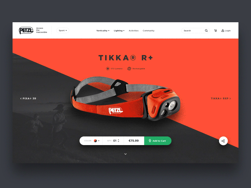
3. Flat Design 2.0
Yes. You are not hearing it wrong. Flat Design is not dying. It evolves.
Back to a few years ago, flat design became popular. We can not deny how clean, beautiful and engage this style is. But now, Flat Design 2.0 a.k.a Semi-flat design is delivering the best impact on people’s engagement by adding nuance and depth to its identity. Semi-flat design focuses on colors, typography, depth and simplicity. By colors, gradients and shadows are coming back to spotlight. A combination of gradients, shadows and an unique typo will result a better performance which will bring a fresh look to your site. Applying this style, you are making your website a simple but delicate interface. You can raise customer’s attraction and interaction by giving them a whole new experience to browse your site.

Semi-flat design brings a fresh look to your site
4. Asymmetric Layout:
We are getting used to the idea that everything on your website should be aligned and symmetry. What if it is not?
Making a website with asymmetric layout should give a different experience for people who visit your website. If you do it right, that different will make a huge impact on how people engage your website. It delivers a fresh look and somehow unique. People will try to explore and spend more time on your site. The longer they spend on your site, the higher chance they can take an action. Psychologically, people are always interested in something new and strange. So make a different with your layout can enhance your efficiency of your site.
Asymmetric layout can hold your customers on your site longer than you can imagine
5. Web-animation:
We all know the fact that a website with full of text is boring. Images make it more interesting. But in the world we are always hurry and time is short, animation can sum up all the idea and messages in a short amount of time than any other formats. Animation makes your site less static and more dynamic. So, customers will stay on your site longer and they have more potentials to take actions. Moreover, there are more and more tools for you to create these animation on your web with ease. It is another reason will make it trending this year.
A site with animations is more interesting to browse
6. Playful illustration:
We’ve seen a lot of illustration on websites since last year. And this year, it still keep rising to be trending.
If you are running a brand, unique illustrations are a incredible way to persuade and inject people into your website. It is not only a lot more fun to watch but also make your website unique and stand out of all other websites.
Illustrations can visually engage people without getting them to experience functionality of your website itself. A good illustration comes with shapes, size, color, dynamic elements and a little of fun. A lot of popular brands are using illustration on their website such as: Dropbox or Box.com
Just like Web-animation, nobody wants a boring website. A few of custom illustration can breathe fire into those dry, boring content. In the saturated and competitive marketplace nowadays, web design should balance functionality and personality, and illustration is one of the perfect way to show who you are.
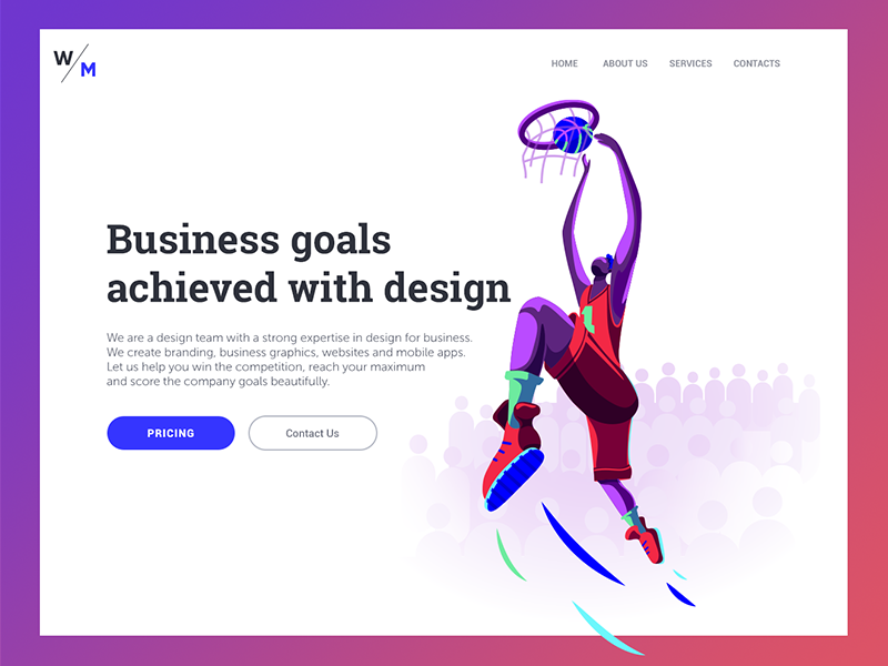
A custom illustration make your website unique and way more fun to watch
7. Split screen:
Last but not least, split screen!
All the information on your website is what you want to deliver to customers. By splitting the screen by half, you are making your website more comfortable to browse. It would be perfect if your content includes 2 types of information formats (E.g: Text and images, Text and videos, Images and videos, …). You can also combine split screen design with some typos and colors to deliver the best browsing experience. The advantage of this style is to focus customer’s sight to each type of information format and make your website way more intuitive.

Split screen make your website more intuitive and easier to engage action from customers
Here are some top web design trends will take the crown in 2018. The main purpose of those styles is to bring the best experience to users and customers along with the highest efficiency. You can evaluate which style should be used more than the others and what style suits you the most. If you have any opinions, just let us know.
And if you are looking for web templates like those above, you can find it with CactusThemes.