Browsing Tag

wordpress video themes responsive

Featured, WordPress Themes, WordPress Tutorials

How to make WordPress video themes responsive

October 17, 2015

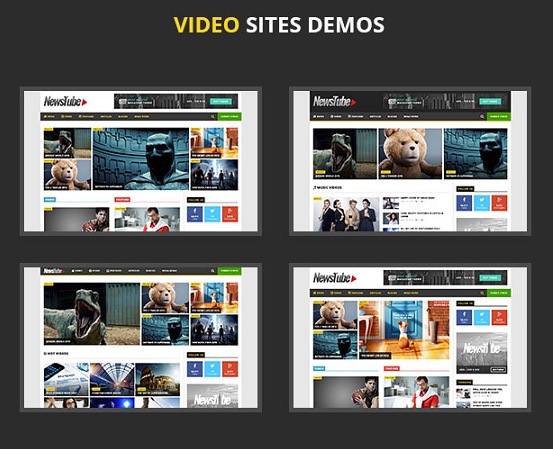
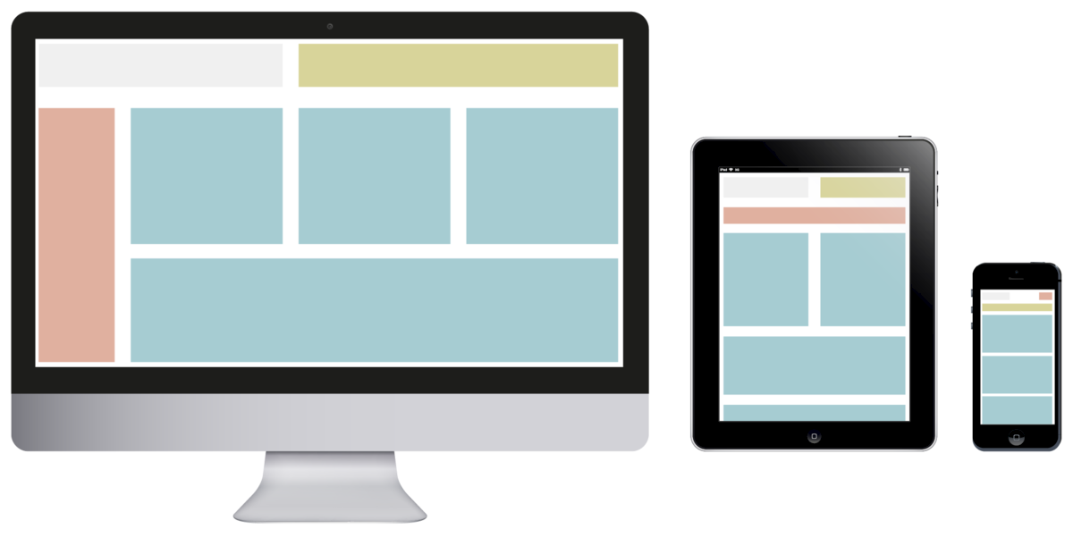
Responsive designs have become a vital part of websites when more users browse websites on smartphones and tablets. Also, Google has considered mobile-friendliness to be one of the standards to rank a site. Under that circumstance, many non-responsive WordPress sites, especially video websites, risk losing their spot in the search ranking. That is the reason why owners need to use responsive video WordPress themes to optimize their sites.

WordPress video themes responsive 2

If you have a video site on WordPress and want to turn it into a responsive one but lack coding knowledge, then this article will help. It is going to guide you how to make WordPress video themes responsive in simple steps.

How to make WordPress video themes responsive

In this article we will take Tenwty Ten theme as example. To make the theme responsive, you need to modify only one file, style.css.

First, put this code at the end of your style.css:

@media only screen and (max-width: 480px) {

}

This is a conditional styling code which tells the web browser that if the screen size is equal or less than 480px, all the styling parameters should be set in between the brackets. And 480px is the maximum screen size of a smartphone.

For tablets, the conditional code will be:

@media only screen and (min-width: 768px) and (max-width: 959px) {

}

For the sake of simplicity, in this article we only discuss responsive video WordPress themes for smartphone. Once you master that, making WordPress video themes responsive for tablets will be very easy.

WordPress video themes responsive 1

After typing the conditional code, you put all the following codes in between the brackets.

The first code will set the main frame size of the theme to 400px:

#access .menu-header, div.menu, #colophon, #branding, #main, #wrapper, #site-title {

width:400px;

}

The second code sets the size of main container:

#container {

width:100%;

}

The container layer width is set to be 100%, which means 100% multiplied by the above layer width. So, it will become 400px as 400px x 100% is still 400px.

The next code will hide the header image of the video theme:

#branding img {

display:none;

}

You can also modify the code above to resize the header image:

#branding img {

width:100%

}

Here the width is set to 100% meaning 100% multiplied by the above layer width.

And, the following code is to hide or re-positions the blog description:

#site-description{

display:none;

}

If you insist that the description must be displayed, then change the code above so it looks like this:

#site-description{

float:left;

}

Next, you set the navigation bar size (width) by using:

#access{

width:100%;

}

Then, you need to set the width of the content container:

#content{

width:100%;

}

Also, set the post content layer margin (position):

.hentry{

margin-left:-13px;

}

The code above will make the post content layer positioned 13px to the left.

Next, you hide the sidebar by using this code:

#primary{

display:none;

}

And resize the footer section: </pre>

<blockquote>

#footer{

width:100%;

}

With the code above you can only resize the main layer of the footer, not its content.

The following one re-positions the WordPress credit text:

#site-generator {

float:left;

margin-top:5px;

}

And the last code will set the footer border’s width:

#colophon {

width:100%;

}

That’s all. Now your theme is responsive. Just practice more and you are able to make your default WordPress video themes responsive without the help of developers.

Featured, WordPress Themes

Key features of popular WordPress video themes on ThemeForest

September 21, 2015

ThemeForest is considered one of the major online marketplaces for website templates, where you can find the best WordPress video themes, responsive templates and more. The question is: what makes those themes popular?

This article will summarize some common features of popular WordPress responsive video themes on ThemeForest. Let’s have a look at them and you will understand the reason why those ones become the best-selling video WordPress themes.

Key features of the best WordPress responsive video themes on ThemeForest

NewsTube wordpress video themes responsive

Modern and beautiful design

Design is the first thing attracting viewers’ eyes. Also, the best WordPress themes on ThemeForest, including responsive video themes, have an impressive design that get the attention of customers at first sight. They are beautiful from font, color to layouts and images.

Each video theme will give a distinct look and feel to your site, helping your school or training center stand out of the rest.

Clean code

A significant part of WordPress users have the demand for customize themes’ code. They sometimes want to add some CSS or modify PHP codes. Therefore, unless a WordPress theme’s code is clean and well-organized, users may feel difficult to customize it. As a result, they will exclude it from their list.

Fortunately, ThemeForest has its own requirements for WordPress core API, features and assets. Therefore, its themes, especially popular ones, usually have well-organized code.

Powerful video features

NewsTube wordpress video themes responsive 2

Being the best WordPress responsive video themes, they certainly support powerful features for different types of video content. Some of the key features include:

  • Embed videos from popular video sharing sites (YouTube, Dailymotion, Vimeo, etc.)
  • Self-hosted video support
  • Video playlist & video channel
  • Built-in widgets for video
  • Video sliders
  • Short-codes for video
  • Custom video players support
  • Video auto-play
  • Video page layouts

Besides, each popular WordPress responsive video theme on ThemeForest has its own unique video features, which differentiates it from other themes, such as video ads support and video submission.

Easy Customization

One of the attractive features of ThemeForest WordPress themes, especially video ones, is that they offer the easy-to-use Theme Options Panel and drag-drop page builder. This allows you to take full control and easily customize various aspects of your theme – even if you are not tech-savvy. For example, you are able to change page layouts, logo, favicon, fonts, colors and much more without coding knowledge.

Sustainable Item Support

Envato always try to improve all aspects of how buyers get post-sale support on ThemeForest. In particular, they provide better tools and feedback for authors, and a simpler, more convenient process for buyers.

Wrapping it up

This writing explains the features that best-selling WordPress responsive video themes on ThemeForest usually offer, including: impressive design, clean code, powerful video features, easy customization and sustainable technical support.

So, here are six eye-catching ThemeForest WordPress video themes (responsive) which you may want to consider for your video content:

  • Invictus – Full-screen Photography WordPress Theme
  • Studiofolio – Versatile Video Blog Theme
  • Soundboard – Responsive WordPress Music Video Theme
  • True Mag – WordPress Theme for Video and Magazine
  • Right Now – Full-width WordPress Video Theme
  • Clubber – Events, Music & Video WordPress Theme