Text Gradient is a simple css trick that allows you to improve your site’s appearance by putting gradients on system font titles using nothing but css and a png image. Do you want to create fancy headings without rendering each heading with Photoshop? Here is a simple CSS trick to show you how to create gradient text effect with a PNG image (pure CSS, no Javascript or Flash)
The most important is use property -webkit-background-clip and -webkit-text-fill-color:
-webkit-text-fill-color : CSS property specifies the fill color of characters of text. If this property is not set, the value of the color property is used. -webkit-background-clip : this property will only have a visual effect when the border has transparent regions or partially opaque regions (due to border-style or border-image); otherwise, the border masks the difference. (values: border-box, padding-box, content-box, text)
To make the css text gradient you follow the example below:
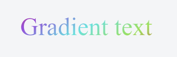
HTML:
<h1>Gradient text</h1>
CSS :
h1 {
display: inline-block;
margin: 0 auto;
font-family: “Roboto Slab”;
font-weight: 400;
font-size: 5em;
background: linear-gradient(330deg, #e05252 0%, #99e052 25%, #52e0e0 50%, #9952e0 75%, #e05252 100%);
-webkit-background-clip: text;
-webkit-text-fill-color: transparent;
line-height: 200px;
}
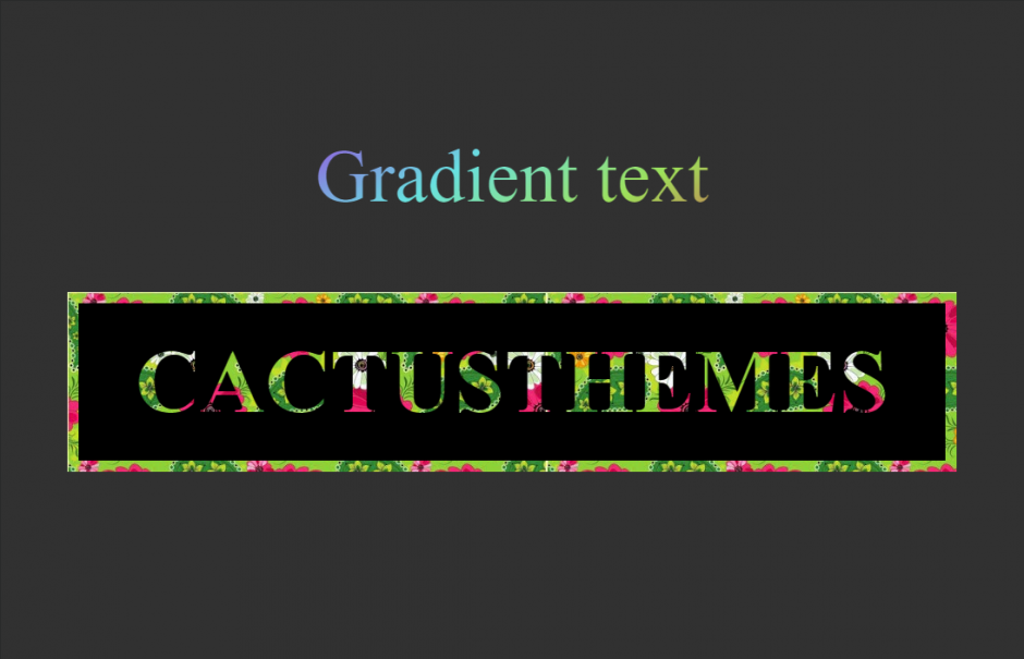
You can replace background is linear-gradient with background is image.
HTML:
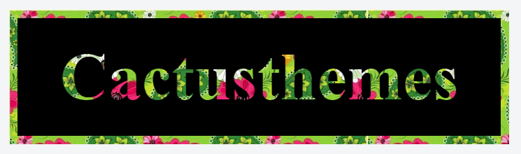
<div class=”clip-text clip-text_one”>Cactusthemes</div>
CSS:
.clip-text {
font-size: 6em;
font-weight: bold;
line-height: 1;
position: relative;
display: inline-block;
margin: .25em;
padding: .5em .75em;
text-align: center;
color: #fff;
-webkit-background-clip: text;
-webkit-text-fill-color: transparent;
background-image: url(http://cdn8.staztic.com/app/a/6278/6278761/hd-abstract-wallpapers-1-0-s-307×512.jpg);
}
.clip-text:before {
content: ”;
z-index: -2;
top: 0;
right: 0;
bottom: 0;
left: 0;
background-image: inherit;
position: absolute;
}
.clip-text:after {
content: ”;
position: absolute;
z-index: -1;
top: .125em;
right: .125em;
bottom: .125em;
left: .125em;
background-color: #000;
}
Please note that currently this method currently works only in webkit browsersm, you need fallback color for internet explorer.
Link demo: