Creating a website includes many steps, but branding seems to be one of the most important factor that you want to care about. If you are working for a company or designing your own portfolio web page, it is necessary to define a characteristic of your site by using perfect color palette. This seems simple but you do want to spend some times to know about it to enhance your site recognization. This article may helps you to find the right color palette using some psychological studies and color theories.
1. Know what emotions you want to deliver
Why do KFC or Burger King use red & yellow color palette for their branding color? Why do most of fashion brands use black and white branding color palette but not other colors?
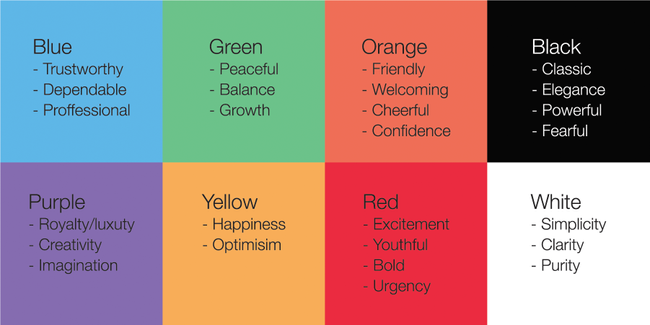
The reason is: Different colors evoke different emotions. Let’s take some examples. Consider Coca Cola, Facebook or Apple. They are extremely recognizable brands. When you hear about them, you can immediately refer to their logos with red, blue and white. It means something. Let’s take a look at this image.

Different colors evoke different emotions
As you can see, it seems like these brands choose their color palette because they simply like it? No. The color of each brand represents what they stand for or at least – what they are trying to stand for.
So whatever you are creating your website for, consider to write down what are you stand for?, what emotions do you want to give to people?, what is your characteristic before you take any further step.
2. Select your dominant colors
Now if you know exactly who you are and what emotions you want to give. Congratulations! It is way much easier for you to choose your suitable colors for your website. You will want your targeted audience to recognize you by these colors.
Once you find your color that represents the best of your characteristic. That would be your dominant colors. You need to start creating your palette. These colors will go long side with your whole website. They should contrast well with each other. You can find them by configuring Tones, Tint and Shades of the dominant color.
- Tones: Mixing gray to the dominant color
- Tint: Mixing white to the dominant color
- Shades: Mixing black to the dominant color

Example of Tones, Tint and Shades
You can spend time on it until you find your perfect palette colors. This color palette will help you a lot to define your website.
3. Select your action color
Action color (or Accent color) is very important when you want to draw viewer’s attention to some specific sections on your website. They can be highlighted items, call-to-action buttons, navigation menu, … This action color should be completely contrast with your palette and engaging people to do an action. For example: A “Buy Now” call-to-action button should be red or orange because these colors are engaging and eye-catching, but in the mean time, these color should be contrasted well. By doing that, people tend to engage by clicking the button.

Example of action color used as buttons
4. Applying the 60-30-10 rule
Once you completing your palette, the final thing to do is to implement it to your website. One of the best guide to implement the color palette effectively is to apply the 60-30-10 rule.
Use 60% of the dominant color, 30% of the secondary color and 10% of the action color.
One more tip: You can also apply this rule for content distribution. Use 60% of negative space, 30% of content and 10% of Call-to-Action elements.

Implementation of 60-30-10 rule
By applying these 4 steps, your website should be balanced both in colors and content and more recognizable.


