For a long time, rectangle is the only shape that a web developer can create using CSS. Most creative non-rectangular layout end in using static image which affects a lot web performance. With the introduction of CSS3 and CSS Shapes, that situation is about to end.
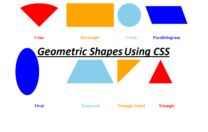
Now you can draw custom paths, like circles, ellipses and polygons using CSS Shapes. Rectangles are too boring to use anymore. These shapes are very common in magazines and newspapers. They are used a lot to arrange content layout, such as wrapping text inside non-rectangular shapes.
CSS Shapes introduction
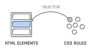
CSS Shapes enable web designers to create more abstract, geometric layouts, beyond simple rectangles and squares. New CSS properties are required to create these shapes including shape-outside and shape-margin. Currently these properties are only available in Chrome, Opera, and Safari, with the -webkit- prefix, hence -webkit-shape-outside.
Let’s take a look at some examples:
HTML:
<div class="support-css-shapes"></div><div class=”wrapper clearfix”>
<div class=”circle”></div>
<p>Sed ut perspiciatis unde omnis iste natus error sit voluptatem accusantium doloremque laudantium, totam rem aperiam, eaque ipsa quae ab illo inventore veritatis et quasi architecto beatae vitae dicta sunt explicabo.</p>
<p>Sed ut perspiciatis unde omnis iste natus error sit voluptatem accusantium doloremque laudantium, totam rem aperiam, eaque ipsa quae ab illo inventore veritatis..</p>
<p>Sed ut perspiciatis unde omnis iste natus error sit voluptatem accusantium doloremque laudantium.</p>
</div>
CSS:
.clearfix:before,

.clearfix:after {

content: " ";

display: table;

}
.clearfix:after {
clear: both;
}
.clearfix {
*zoom: 1;
}body {
font-family: “Helvetica Neue”, Helvetica, arial, freesans, clean, sans-serif;
color: #66595c;
background-color: #faf6ec;
}/* Start the styles */
p {
line-height: 1.68;
}
h1 {
margin-bottom: 0;
}
h2 {
margin-top: 10px;
font-weight: 400;
line-height: 1.6;
}
.wrapper {
padding: 30px;
max-width: 720px;
margin-right: auto;
margin-left: auto;
}/* Styles start here */
.circle {
width: 250px;
height: 250px;
background-color: #40a977;
border-radius: 50%;
float: left;
shape-outside: circle();
-webkit-shape-outside: circle();
margin-right:20px;
}
Demo:
http://jsfiddle.net/TrinhThang/a4xekkaw/
Values:
- circle(): for making circular shapes.
- ellipse(): for making elliptical shapes.
- inset(): for making rectangular shapes.
- polygon(): for creating any shape with 3 or more vertices.
- url(): identifies which image should be used to wrap text around.
- initial: the float area is unaffected.
- inherit: inherits shape-outside value from parent.
The following values identify which reference of the box model should be used for positioning the shape within:
- margin-box
- padding-box
- border-box
These values should be appended to the end, for instance: shape-outside: circle(50% at 0 0) padding-box. By default the margin-box reference will be used.
Browser support
This browser support data is from Caniuse, which has more detail. A number indicates that browser supports the feature at that version and up