
Responsive design is an approach to web design, which is aimed at crafting websites to provide an optimal viewing and interaction experience. It is easy reading and navigation with a minimum of panning, resizing and scrolling through variety of devices from desktop to mobile phones.
A responsive design adapts the layout to the viewing environment by using fluid, proportion-based grids, CSS3 media queries, flexible images and more.
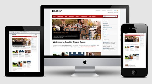
So, what is a responsive education theme WordPress? It is a education theme WordPress that has responsive layouts and is able to display well on any device, from desktops and tablets to smartphones. With the recent trend of responsive web design, designers are creating more responsive education themes for WordPress.
Advantages of a responsive education theme WordPress
Excellent User Experience
While content is the foremost success metrics, user experience enable visitors to consume content on any site through the device of their choice and preference anytime. So a responsive education theme WordPress is to provide the optimal user experience irrespective of whether they use a desktop computer, a smartphone, a tablet or a smart TV. Using a responsive education theme WordPress will satisfy busy users and wide-awake college students who want to access to your site anytime, as well as any visitors who want to access your website from their favorite devices, which have no scrolling and resizing.
Cost Effective
By using a responsive education theme WordPress, you have no longer to maintain two separate web addresses for your school site (one for web and anther for mobile). It’s important to compare the advantages of having single site that conforms to the needs of all devices with having two separate websites. One website is cheaper than two and it’s important if you pay attention to saving.
Also, mobile sites do not offer advanced navigational techniques like traditional websites. This is not convenient for the site visitors; as a result, they leave your site and check out the competitors’ ones. Responsive WordPress theme for education helps you solve that problem and enhance SEO efforts by allowing your visitors to direct to a single site no matter what device they use.

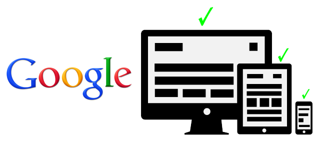
Recommended By Google
According to Google, responsive web design is its recommended mobile configuration. Thus, using a responsive education theme WordPress will help to improve your site’s Google ranking.
In particular, a site with responsive design has only one URL and the same HTML regardless of device, which makes it more efficient and easier for Google to crawl, index and organize the site content. It is in contrast to a completely separate mobile site: the mobile site’s URL and HTML is different from its desktop counterpart, which requires Google to crawl and index multiple versions of the same site.
Furthermore, content displayed on one website and one URL is much easier for users to share, link to and interact with than content displayed on a separate mobile site.
Easy To Manage
If you have two separate sites for desktop and mobile, this means that you need to have two separate SEO campaigns. Obviously, managing one site and one SEO campaign is much easier than managing two sites or two SEO campaigns. This is an important advantage that responsive education theme WordPress brings to you.
With the development of education theme WordPress is taken to a new level and able to satisfy the needs ò almost educational organizations. So, it’s time for you to start!